I am the co-director and co-founder of the Boston-based dance company called Nozama Dance Collective, a contemporary dance group comprised of young women who want to inspire others through dance. We choreograph pieces pulling from the positive and negative experiences we have faced as women. The name “nozama” came from the decision to upturn all the negative associations with powerful “amazonian” women and show a revitalized and hopeful perspective on empowered, young women.
| BEFORE | AFTER |
 |
When originally designing this identity, we wanted our brand to evoke movement, power, energy, hope, and community. Over the years our company has focused more on empowerment of individuals and strength of women as a collective so we decided to change our visual direction to reflect that while increasing the flexibility of the design for scaling and variation. Though this feels like a big change, there are a few things that we didn’t want to lose from the original design: representing a woman, the hint of motion, and how the “z” plays with the other letters. Below are the original concepts:
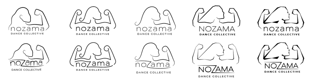
We wanted to keep that hint of movement in the logo which led to a few options that ranged from feminine and soft to crisp and strong. However, instead of featuring three women, we chose to show one nondescript, muscle-bearing woman to represent us as a whole. This gesture became a symbol for our dance company thanks to a pivotal piece in our repertoire called “Bodies and Choices” in which this pose is featured frequently. We landed on concept this concept, which we felt embodied the concept of strength the best while the shifting weight of the lines added hint of softness and movement. While the “z” is simplified from the original, it more heavily emphasizes movement and still alludes to community by the stems reaching across the other letters.
Below you can see how the design is much more flexible for different use cases.


You must be logged in to post a comment.